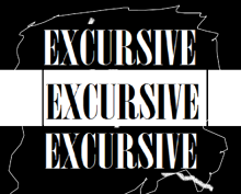
1st Logo (1985)
Nicknames: "This Logo's Actually Excursive" "Asymmetrical's Grandfather" "My Exam Replacement" "The Logo With Extreme Strobe Lights" "Ear Booker Productions's South African Sister" "The Reason Why I Didn't Watch Shaka Zulu: The Series" "The Hot Subject Matter" "Permitted Never, Abandoned Forever" "The Logo With the Prints Gone" "The Rarest Nightmare Logo"

Logo: We see an "explosion" rotating very rapidly and zooming before the viewer's eyes. The explosion has too an excessive amount of moving comets hugeing it, causing said explosion to transfer into a series of drawings with large and short pens and pencils, all jumbled up in one, a la Mr. Messy from The Mr. Men Show. The text "EXCURSIVE" in Bodoni MT Poster Compressed, along with the lines still drawing, zooms out to the screen, and the screen turns into an extreme widescreen. The "EXCURSIVE" now transfers into three, with the two of them now being white, but with said two texts rotating either up or down very rapidly, with an short amount of drawings from the last scene. Lines are seen on the "EXCURSIVE text and the logo then zooms out to us, with the series of drawings returning, all with the logo itself being mattered into strobe lights.
FX/SFX: Everything in this logo, all made with excellent 2D animation and drawing messes..
Cheesy Factor: But does that really excuse the subject matter presented? Even if the animation is cool, we have extremely dated effects. For example: The explosion doesn't look really like an explosion, that's the triangle-liked vortex you see in superhero comics, in the "BOOM" square. The comets are three dimensional-liked, even if unintentional, and the strobe lights can induce many people seizures.
Music/Sounds: A series of loud, rustling and post-apocalyptic sounds with the comets and the "explosion", an real explosion sound when the drawings appear, Some unexplicable sounds, conjointed with a sound you hear in the opening theme of the cartoon "Whoopass Stew!", even though it never aired, and to finish, electricity sparklings and a conjoint of men screaming, said effect is on this video: "YTPH Peppa hace c**a roja" at 2:38, and a conjoint of loud drum quintuplets when the text zooms to us.
Availability: Extremely rare, bordering on extinct. Seen on the SABC series "Shaka Zulu", which consisted of only 10 episodes.
Scare Factor: Nightmare. The inexcusable subject matter, The epileptic effects, that make people seizures along with the extremely dated and zoom-in (a la V-of doom) effects, the sounds that contain in this logo, the jumbled men screaming like startling and jumping at the same time may keep you awake all night. It is a rare coincidence that it follows the quiet San Bugi Producciones logo, a company based in Equatorial Guinea, which co-worked with the series. Also, considering the fact that Shaka Zulu is based on both real and fake horror stories, this ain't too surprising. Thankfully, the next logo is less scarier, and more cheesy.
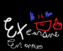
2nd Logo (1994-1996)

Nicknames: "The Worst African Logo Of All Time" "The Understandable Logo Of Bad Animation" "The Cheesy Face" "Klasky Csupo Even Cheesier Brother" "The Logo With Prints Gone 2" "The Personification Of All That Understandable" "The Cheesy Logo With No Explanation" "The South African Bad Animation Logo" "Tame/Cheesy Excursive Enterprises" "Zombastic Productions South African Brother"
Logo: On a black background, we zoom out to a red-drawned face with blue "hair", and a hand, which points the next-to-middle finger, and writes "EX cursive" in a cursive font and "En terprises" in a cursive-imprint font. The hand then gets back to the face and then the whole logo shines.
FX/SFX: All in excessive 2D animation.
Cheesy Factor: Sheesh! And we thought the previous logo wasn't enough! This logo literally has no order, and most of the logo consists of very bad animation. Also, the face and the text are just weird, notice that the "blue hair" isn't good at all, and only consists of sound, and the text needs to be in a original font, not that is a great, unsignificant cursive font that isn't understandable at all! The logo is also tacky, as if the people who made it were extremely bored due to lack if ideas. The music doesn't fit in this logo, and the zooming in was completely unnecessary. The quality also looks very cheap, which adds to the cheesiness of this. The logo also shows up possibly hundreds of times accounting for the drawing of the text, it seems like the face is pointing the middle finger! Overall, speaking more about the logo itself, this is up there with the Green Bunny (Japan) first logo! To finish it, This could be a contender for the worst logo ever.
Music/Sounds: Traditional but brief South African music, consisting in bongoes and an excellent strum of guitar, followed by a FremantleMedia-ish ending.
Availability: Seen only on the only three full-length series produced by it: Sock into the Grass, Zeka Hoyue i Bashkadani, and Heat Futball.
Scare Factor: Medium. It depends on what do you think about this so called "logo", even being tamer than the previous logo. However, it's too cheesy as if the South African producers won't care!
